When you invest in stocks, you invest a sum of money in the shares of a company in order to make a profit within a certain period of time. By owning shares in that company, you also own a share in its profits and assets.
Why should I consider investing money?
Now that conventional forms of saving are hardly yielding any returns due to low interest rates and rising inflation rates, basic knowledge of financial issues is becoming increasingly important. If you are thinking about investing in stocks, you should always inform yourself about the (sometimes) considerably higher risks involved in investing in securities of all kinds.
How can I analyse a stock?
Now that you have familiarised yourself with the basic questions about a stock in this article and have learned more about research, we will dive deeper into the topic of stock charts. With chart analysis (also called technical analysis) you can identify features in the price trend that you can use to assess the future price development of assets and a market in general.
In order for investors to more accurately research and assess the advantages, but also the risks, of a long-term investment in the stock market, they use various methods. These include fundamental analysis, quantitative analysis and finally technical analysis (chart analysis).
Fundamental analysis (FA)
In fundamental analysis (FA), an investor analyses the economic and financial factors associated with a stock's performance to determine whether the stock is potentially overvalued or undervalued. Special attention is paid to the influence of economic developments on a company's industry as well as the effectiveness of the company's management.
Quantitative analysis (QA)
As part of the quantitative analysis (QA) of a stock, mathematical and statistical models and measurements are used to analyse numerical values. Past, current and likely future events are used. The goal is to identify investment opportunities - what are the conditions which a particular stock should be bought or sold under?
For example, if you look at financial ratios such as the price-earnings ratio (P/E) or earnings per share (EPS) before investing in a company's stock, this would be considered a very basic quantitative analysis.
Technical analysis (TA)
A third method of evaluating a long-term investment is technical or chart analysis. Here, investors and analysts assume that patterns, returns, historical price developments and other data from the past also say something about the future development of a stock or a market.
The first origins of this method can be traced back to Charles Dow, founder of the Wall Street Journal and the Dow Jones Industrial Index. He strongly represented the view that by analysing the entire stock market, it was possible to accurately assess the prevailing economic conditions, major market trends and the likely future performance of an individual stock.
How do the basics of chart analysis work?
Chart analysis therefore assumes that the necessary knowledge can be derived from the price development of an asset. As you remember, a stock chart is a graphical representation of data, such as prices, using a chart. Even if you don't have any prior knowledge, you can find easy-to-read stock charts on Bitpanda to help you get informed.
What is a share price?
As a reminder, here is our example chart again (Note: this is not a buy recommendation for this stock, but instead only an illustrative example):
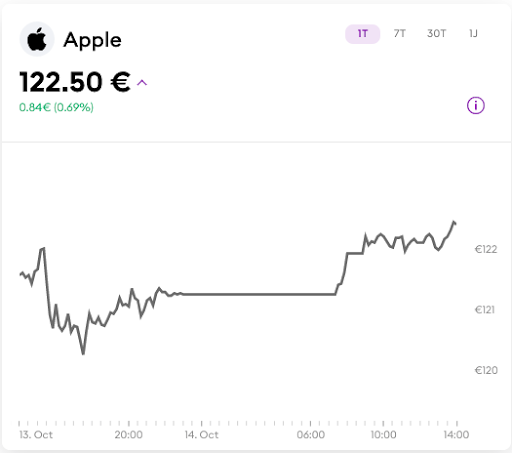
Note: Historical performance is not an indicator of future performance. Investments can go up as well as down in value.
From left to right, a horizontal (straight) axis runs at the bottom - the course of time. The vertical axis on the right shows the price per stock. To follow a price exactly on the Bitpanda website, move the cursor of your mouse along the curve in the chart.
The daily high is the highest price achieved by a stock on the current date. This price is shown in the example chart as €122.50. In the upper-right corner you can use the mouse to call up price data over a time frame of one, seven or thirty days or one year.
Frequently used indicators in chart analysis
Let's now take a closer look at the basics behind some of the indicators that can be used in chart analysis. Since advanced knowledge is necessary for sound chart analysis, we will only go into the basics here. A more advanced and much more precise analysis for traders is offered by chart analysis using candlesticks , the respective indicators and their interpretation.
Price action
In the broadest sense, trends in price movements are observed here (preferably in the case of particularly volatile assets). Which trend is easiest to spot, do you think? That's right: Is the price going up or down?
In its simplest form, a chart shows how the price of an asset (a stock, an index, a cryptocurrency) has developed over time. This price development can be recognised by the jagged curve that runs from left to right in the middle of the chart - which shows the price development of the asset.
Patterns in the chart and trend indicators
Upward general price movement from the lower left to the upper right represents, in the broadest sense, a price increase over a fixed time frame. However, if the price is generally descending from the top left towards the bottom right, it is a price decline over a fixed time frame.
A price can basically move upwards, downwards or sideways. By "sideways" we mean that the price moves neither clearly upwards nor downwards during this time and only low turnover is to be expected.
If a downward trend, i.e. a falling curve, can now be seen to be moving upwards again, prices rise and a positive market sentiment arises. The opposite is true, of course, for an initially rising curve that then goes down.
Trends are generally divided into short-term, medium-term and long-term trends - in practice, there are countless interpretations of them. Some trends can last for a few minutes or hours, some for weeks and months.
Volume and momentum indicators
Although only price indicators have traditionally been used for technical analysis, bar charts that can be found under a chart can also show you the trading volumes within a time frame. In very general terms, the following assumption applies: if the volume of the traded asset increases, a trend is starting; if the volume decreases, a trend is coming to an end.
The speed or slowness of price to rise (positive trend) or fall (negative trend) over a given time frame is known as momentum and can also be used as an indicator of the appropriate time to buy or sell an asset.
Oscillators
In its simplest terms, an oscillator is an analytical tool that compares the range between highs and lows over a given time frame. An example of this would be comparing the current closing price with the trading range (the range within which the price moved) of the previous day.
A Stochastic oscillator, for example, tracks momentum only. To use it, two lines are drawn on the chart between which the price is replicated as in a kind of channel: the indicator itself and a signal line, also known as a "trigger line".

As soon as another indicator or line crosses the signal line, this can be interpreted as a signal or indication that something of potential importance is happening to the price of an asset.
Support level, resistance level and moving averages
Support and resistance levels indicate price levels on a chart that appear to be supportive or resistive in limiting the market's range of movement.
Again, the price is replicated here as a kind of channel between two lines: The support level shows the level where the price regularly stops falling and starts rising again, while the level where the price normally stops rising and starts collapsing again is called the resistance level.

The moving average as an indicator can also be plotted on a chart to determine support and resistance levels, from the highest to the lowest item in the price trend to see which direction the trend is moving. If the trend line is moving upwards, this moving average line can be used as a support level and if it is moving downwards, it can be used as a resistance level.
Do you also want to start investing? Simply register on Bitpanda and invest in stocks* and ETFs* of large companies with Bitpanda Stocks around the clock, commission-free and with tight spreads.
*This blog article is not intended to be used as a general guide to investing and should not be seen as investment advice. Bitpanda Stocks enables investing in fractional stocks. Fractional stocks in Europe are always enabled via a contract which replicates the underlying stock or ETF (financial instruments pursuant to section 1 item 7 lit. d WAG 2018). Investing in stocks and ETFs carries risks. For more details see the prospectus at bitpanda.com.
 Cryptocurrencies Buy, sell & swap cryptocurrencies
 Stocks* Invest in stocks with zero commissions
 ETFs* Invest in ETFs 24/7
 Crypto Indices The world's first real crypto index
 Precious Metals Invest in precious metals
 Commodities* Invest in commodities 24/7
 Leverage Go Long or Short on top cryptocurrencies
 Bitpanda Crypto Index Never miss out on the next asset
 Savings Plan A savings plan for Bitcoin and more
 Bitpanda Spotlight New assets are waiting for you
 Bitpanda Cash Plus Earn high-yield returns from 24/7 availability
 Bitpanda Club Additional benefits for our most valued customers
 Bitpanda Blog Be the first to learn the latest news, announcements, and stories from the world of investing, cryptocurrencies, stocks and precious metals
 BITCOIN What to know when you are just starting to invest
 ASSET MANAGEMENT Your investment, your assets: Why your money is safe with Bitpanda
 BTC halving 2024 The next Bitcoin halving event is almost here and we have everything you need to understand and prepare for this pivotal moment in crypto history.
 COUNTDOWNBitcoin Halving Countdown 2024
 ACADEMYWhat is the Bitcoin halving?